This is a website about a book about pigeons.
The book is about doing something good, once, and trying to do it again, and forgetting how hard it was to do it the first time.
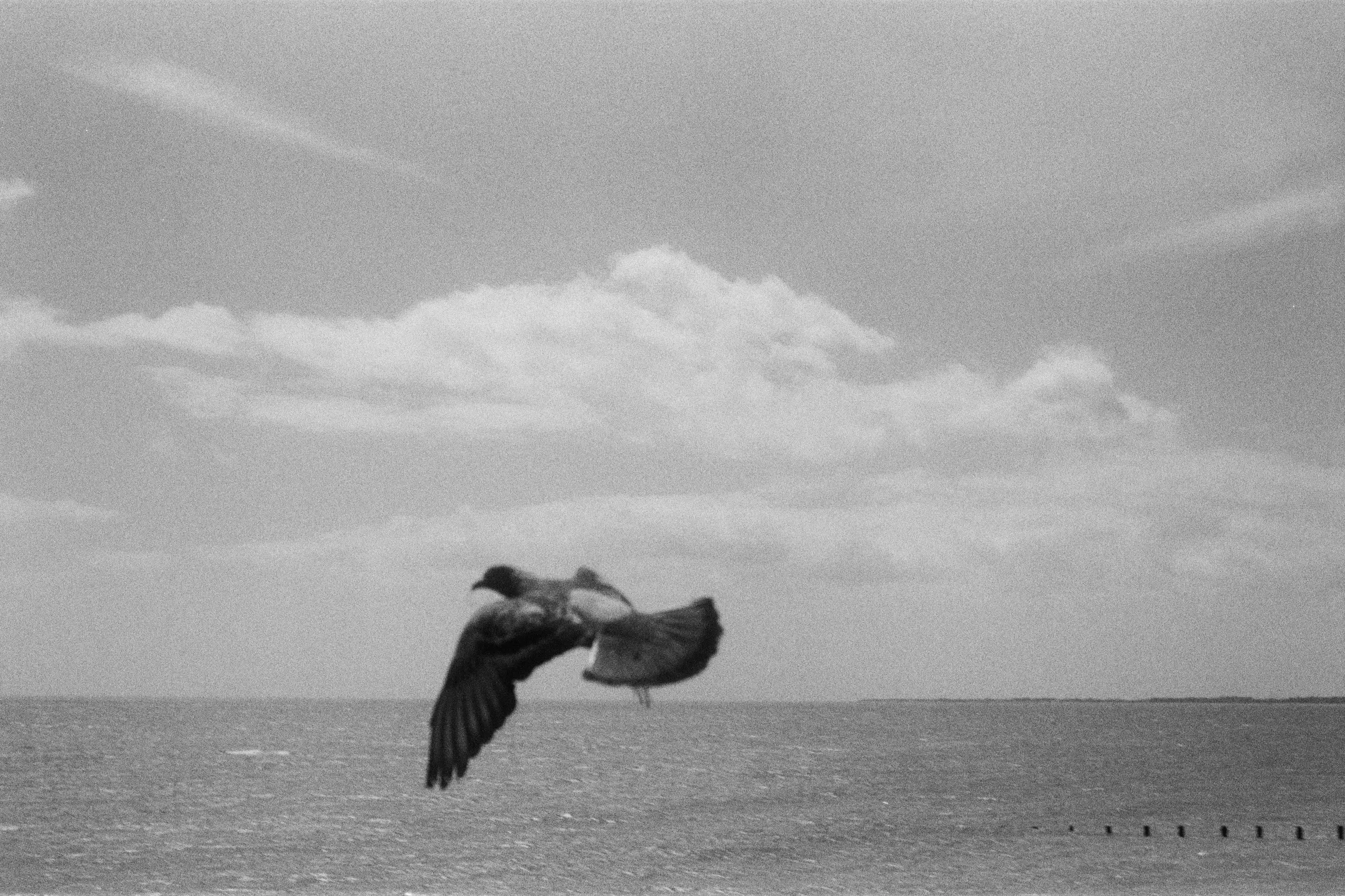
When I made the book, I was thinking a lot about my past photography. I had spent a year away from my camera, and when I picked it back up, my new work felt flat. I felt like I’d lost my touch.
This was most evident in the skies of my new pictures.
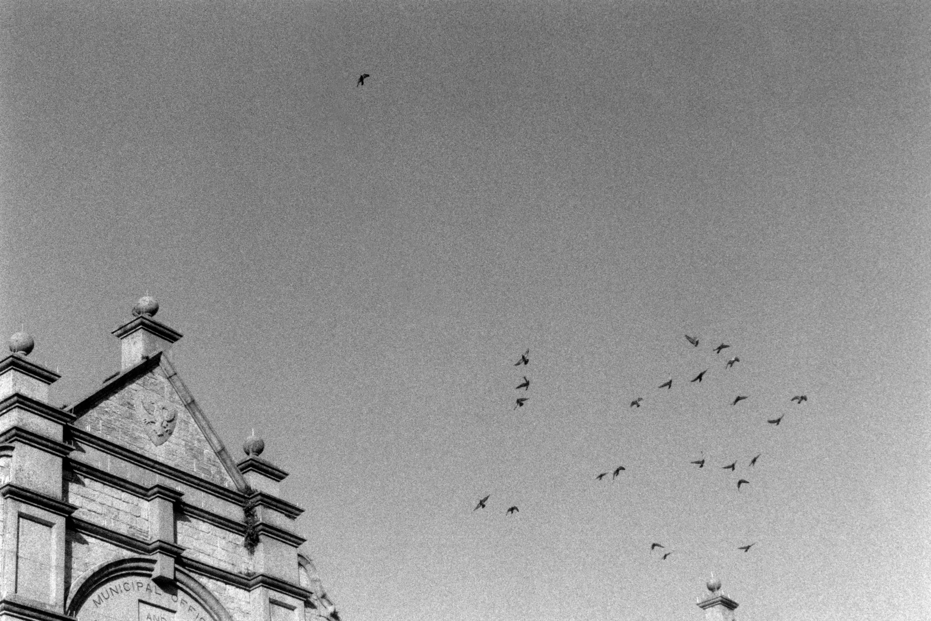
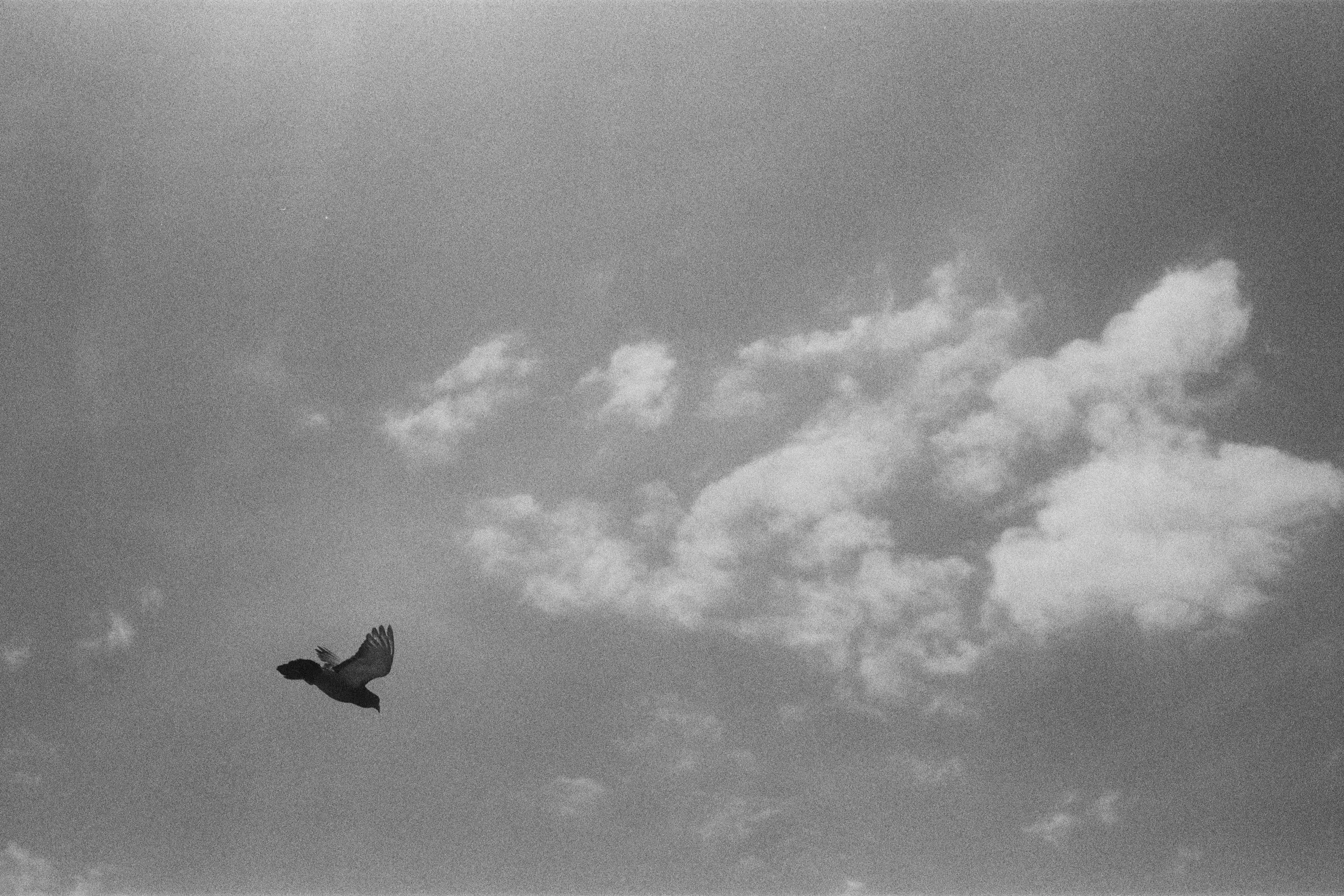
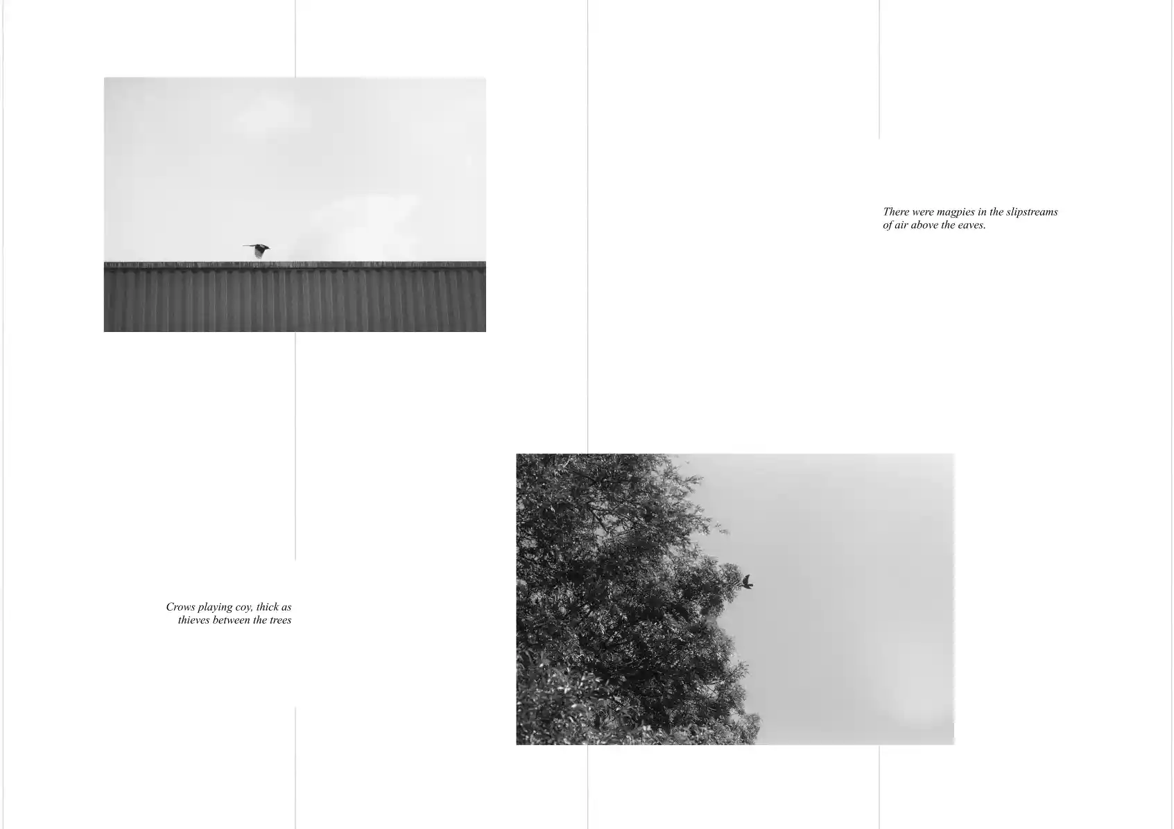
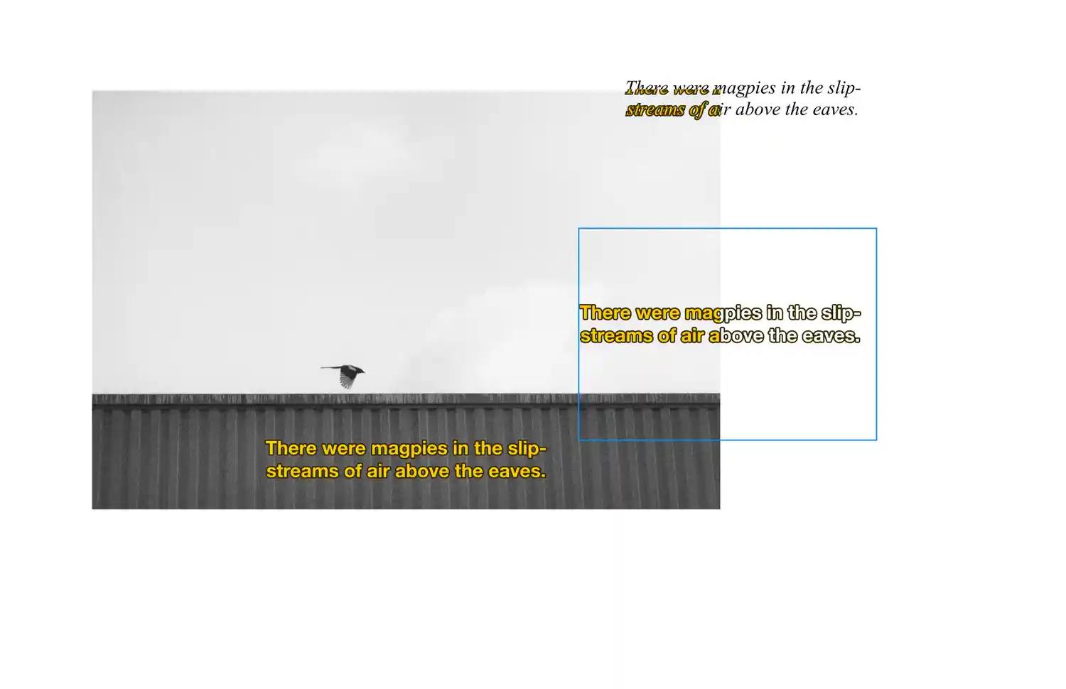
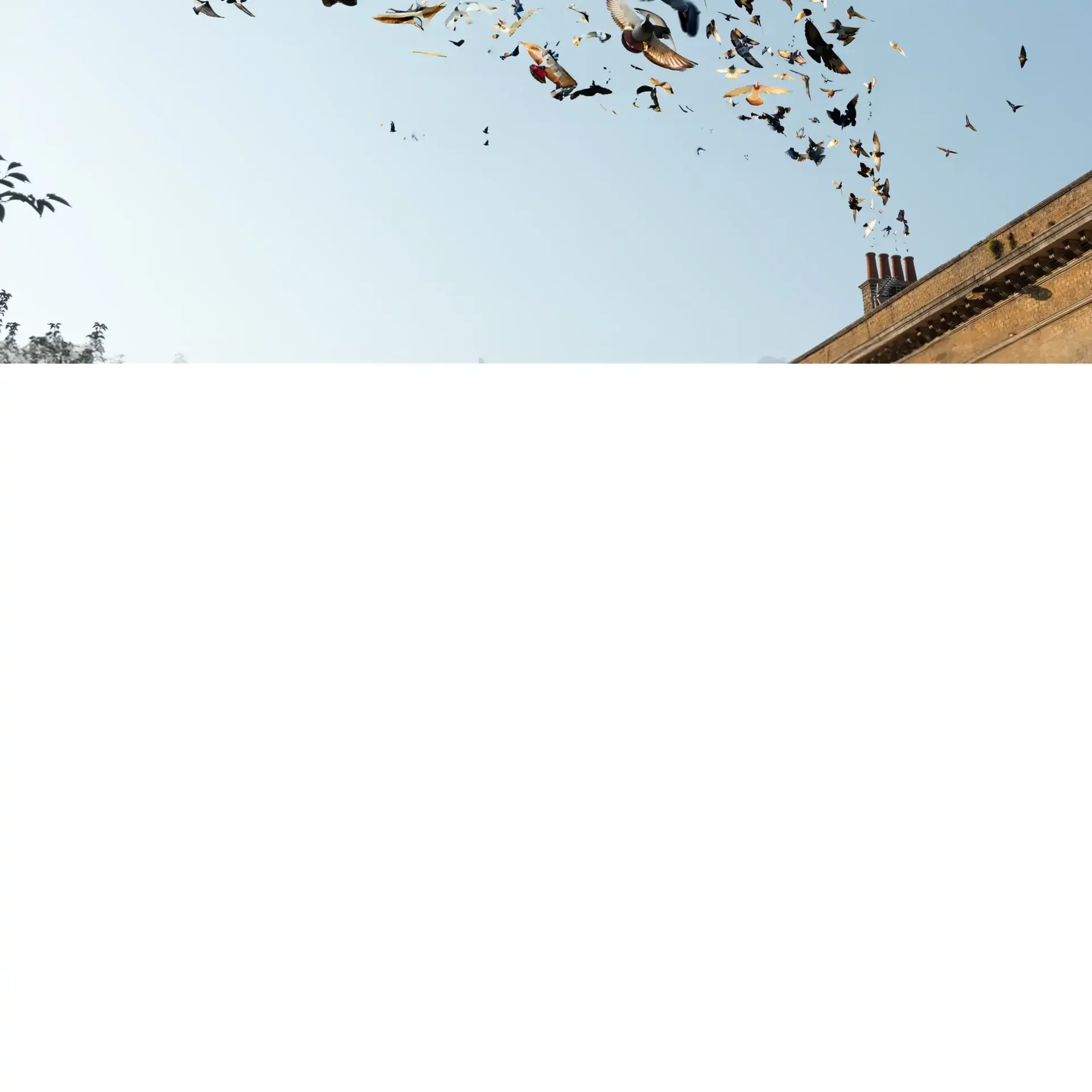
My old photography was full of birds. There were birds on telephone poles, birds strutting down gutters and gables, birds among the clouds, between the trees, and in the corners of the sky.
And in my new pictures, the skies were all empty.
I thought I had lost my touch, but really I just wasn’t being patient. In that year of inaction, of looking back without moving forward, I had forgotten that good pictures—pictures with punctum, pictures of some decisive moment—take hard work. You have to keep showing up.
(More about the book here.)
Returning
I made the book in 2024, and, almost exactly a year after it was finished, decided it needed a website.
I’m really proud of the book. It’s an extremely satisfying to have such a hefty manifestation of an art that lives mostly on hard drives. It’s physicality is one of the things that I love most about it. It’s a pleasing object.
But often, whenever anybody asked to see it, I would have to send them the pdf, instead of a copy of the actual book. It felt flat. A pdf doesn’t do anything justice. A pdf is like death: a great equalizer.
I thought to myself: I’m a programmer; wouldn’t it be fun to turn this into a website?
Choosing a form
I started by directly translating the book to html. At the beginning, I thought this would be a small project. All I wanted was a link to send people who didn’t have access to the physical book.
But a direct translation is never a good translation.
I started with a 12-column grid, and laid out the images and text in a way that matched the book. This looked fine in Figma, but as a website it was static, uninspired. It was too easy.
The main problem, I think, was the text. It was too small, secondary to the images. I wanted the text to feel less like captions, and more like narration, an equal part of the story.
So I took inspiration from TV subtitles. I really love subtitle yellow, but it proved too distracting.
I ended up sticking with black on white, and centering them on the screen. I used GSAP’s SplitText plugin to animate entry/exit, and set up a simple api for adding these subtitles to sections on the page.

So that’s the basic form I chose: images in a 12-column grid and a subtitle box for the narrator.
Now, I needed to break it.
Emphasizing Chaos
The second act of this project is a descent into AI madness. The narrator, unsatisfied with the lack of pigeons in the sky, decides he must do it himself.
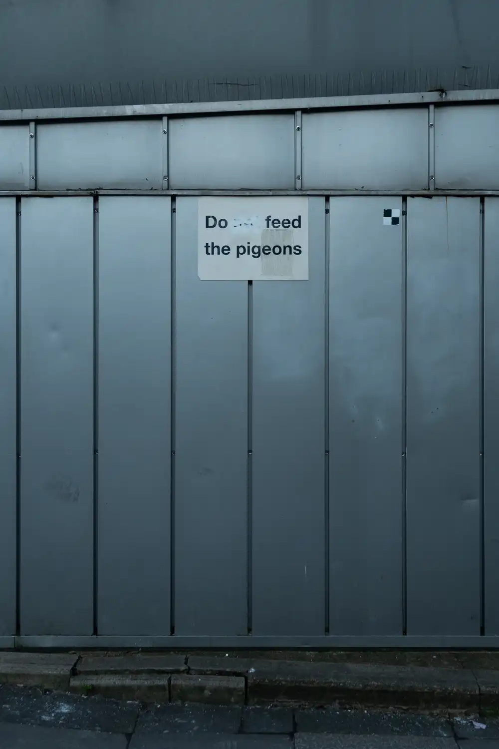
A photobook is a good medium in part because it’s rigid. One of the mechanisms of storytelling is the setting and breaking of expectations, and it’s very easy to set expectations in a book. In this book, most pages have an image and some text. When pigeons overflow the expected bounds of an image, it’s a very obvious change. It’s easy to convey a departure from the status quo when the status quo is limited and uncomplicated.
On the web, however, there are no such constraints. The status quo is already animations and popups, cookie banners and autoplay, content upon content upon content atop a dizzying tower of ungodly css. In the medium of the web, an image with overflowing pigeons isn’t much of a surprise.
So, in order to accent the second act, I tried to give the first act more structure, more form.
I used a simple grid system to position the images so that, when the pigeons started spilling, there were rules to be broken. I tried to emphasize this with grid lines, taking inspiration from the lovely lucie.tokyo, but I definitely under-delivered. When I have more time I’d like to come back and play around with a more dynamic, textural background.
I added a lot of spacing between images, to make sections with pigeons feel more crowded. (Too much spacing? I used vh units for vertical margins, and I’m not sure that was the best idea.)
I used Times New Roman because I like it, and because it’s what I used in the book, but also because it’s the definition of status quo, and because, when the pigeons got crazy, I could switch to Tom’s New Roman, an incredible hand-drawn font created by Tom7. I also considered using Times New Bastard, or Times New Arial, but Tom’s New Roman had exactly the wonky, ransom scrawl I needed.
Generating
I already had a set of AI-pigeon-images (read more about them in the book’s afterword), but, as previously discussed, they weren’t going to cut it. On the internet, the bar for weird is higher.
First, I tried animating my previous images. Because I had generated most of the pigeons separately, they were already in their own layers, so I just created 4-6 frames for each one, and set the up to flick through when they come into frame.
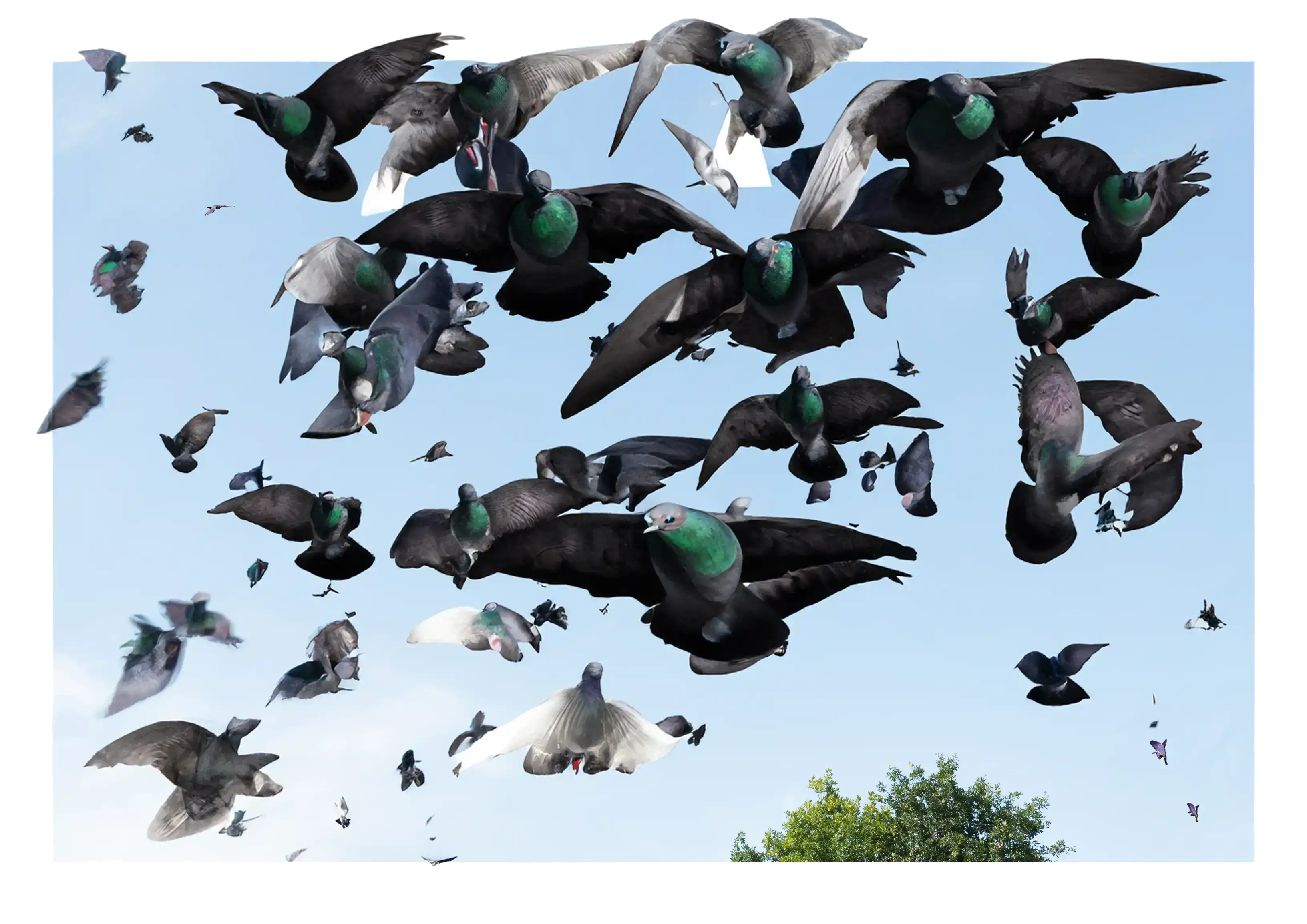
As I progressed, though, I realized the most chaotic images in the book weren’t chaotic enough for the website. I started adding more pigeons.
I pushed it, and the results got weirder and weirder.
Some example prompts:
pigeons the likes of which the world has never seen. So many pigeons I am drowning in pigeons. There will never again be a pigeon shortage.
a little troupe of faraway flying pigeons, no more than specks against the clear sky
un troupeau de pigeons noirs
un troupeau de nombreux petits pigeons
curly wingus flee pigeon curly whingus fleet dove
scheming devious little pigeons
Folkbird, Yorick, Absalon, Juno, Ajax,Ragozine, Heinlein, Heinrich, Heimlich, Heinz, Herman, Hector, Gregor, Flector, Edgar, Allen, Alan, Turing, Midas, Norbert, Knot, Calvino, Olivier, Oreste, Anne Marie, Vivianne, Vivian, Encarnación, Noam, Jean, Jen...
the golden gate bridge (this generated a single pigeon)
And then I came across pyramid.chat, which is a funny website in itself, but its Corporate Structure diagram caught my attention. This is a great example of setting and breaking expectations: at first, it’s a funny little chart, but then it grows, and melts, and soon your screen is on fire and there are skulls everywhere and—
And before you know it you’re doing the same thing on your website, only instead of a corporate structure, you’re illustrating the descent into pigeon-hell.
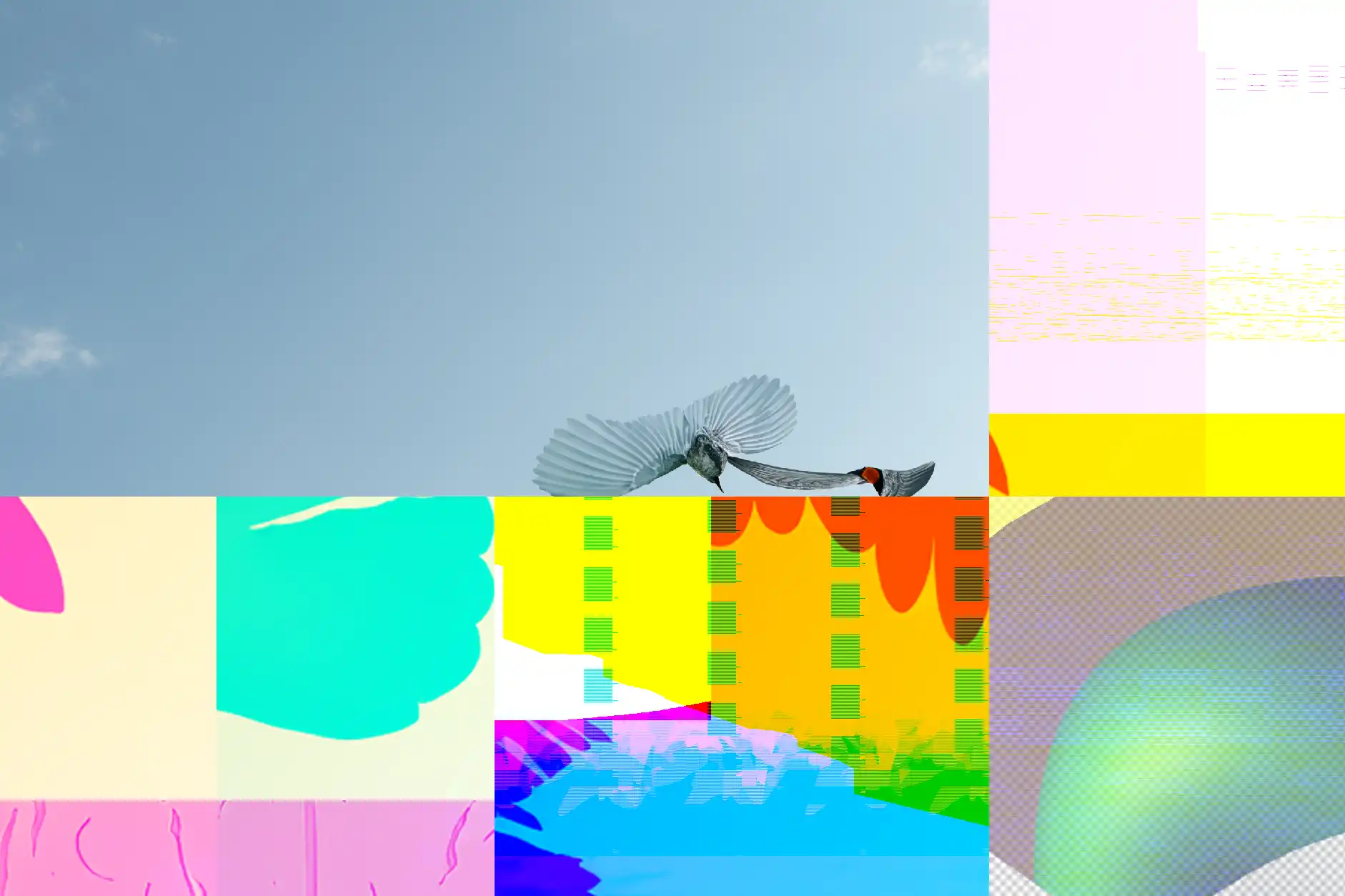
I started with the climax image from the book, an image of pigeons spilling out of a chimney, and extended it down. I used Photoshop’s expand tool to expand the canvas and fill in the new space. I did this 4-5 times for each layer, and blended them together.
And then, at some point in this process, as my pigeon-hell stack grew, Photoshop flinched.
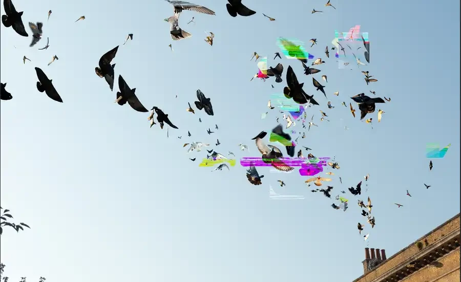
As I panned up, glitches danced across the image. I tried to export the image, but the glitches were only a visual artifact in Photoshop itself. So I took a lot of screenshots.
This was the chaos I was looking for. This was my decisive moment.
They’re almost perfect. I could have created collages like this by hand, but that would have gone against the spirit of the project. I tried to make compositions like this using Photoshop’s AI tools, but they were incompetent; it was like doing surgery with a crowbar. It took patience, trial, and error—and my computer deciding that it had had enough—to make something that felt like a miracle.
I’m hesitant to say that this is the same kind of hard work that I had forgotten when I set out to make the original book, but there’s definitely a parallel. Even in a project about AI art, where I was letting myself explore these tools, it still took an irreproducible miracle to make something good. I still had to wait for the decisive moment.
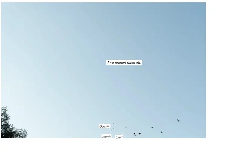
Naming
I also spent a very long time naming pigeons. At last count, I named 390 pigeons. This was all done by hand. I came up with each name myself, and positioned each label myself. This took almost an entire day.
There’s something interesting in working so painstakingly on an automatable task in a project already full of AI slop.
The parts of this project that AI would be best at (creating a website, listing hundreds of names) I did myself, and the part that I am best at (taking pictures of skies full of birds) I offloaded on AI.
Finally
When I was making this website, I just wanted it over and done. I had a lot of fun, and I learned a lot, don’t get me wrong, but I already did this project! And here I was, doing it all over again.
I expected it to take a few days, but I spent two weeks doing this. When I made the book, I was thinking a lot about my old photography, and feeling like my newer work wasn’t as good. But when I was turning that book into a website, I just wanted to move on. I just wanted to make something new.
I think that’s progress.
Duncan Petrie
August, 2025
Buy a copy of the book, see this project on github, go back to the web version, or check out my other work at duncanpetrie.com.